Data Visualization
The process of translating data into a visual context (A graphical representation of data). This process is very important because it allows businesses to see the relationships and patterns between the data. Visualization makes large datasets coherent and makes them more accessible and understandable.
Line Chart
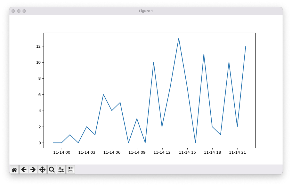
A line chart is a graphical representation used to track changes in data over time. It displays data points connected by straight lines, making it easy to visualize trends, patterns, and fluctuations. Line charts are commonly used for time-series data, such as stock prices, temperature changes, website traffic, or sales performance
Example
from datetime import datetime, timedelta # Import tools to work with dates and time differences
from random import randint # Import function to generate random numbers
import matplotlib.pyplot as plt # Import Matplotlib for plotting graphs
x = [datetime.now() + timedelta(hours=i) for i in range(24)] # Create 24 timestamps (one per hour starting now)
y = [randint(0, i) for i, _ in enumerate(x)] # Generate random values based on index position
plt.plot(x, y) # Plot the x (time) and y (random values) data
plt.show() # Display the graph
from datetime import datetime, timedelta
from random import randint
import matplotlib.pyplot as plt
x = [datetime.now() + timedelta(hours=i) for i in range(24)]
y = [randint(0,i) for i,_ in enumerate(x)]
plt.plot(x,y)
plt.show()
Output
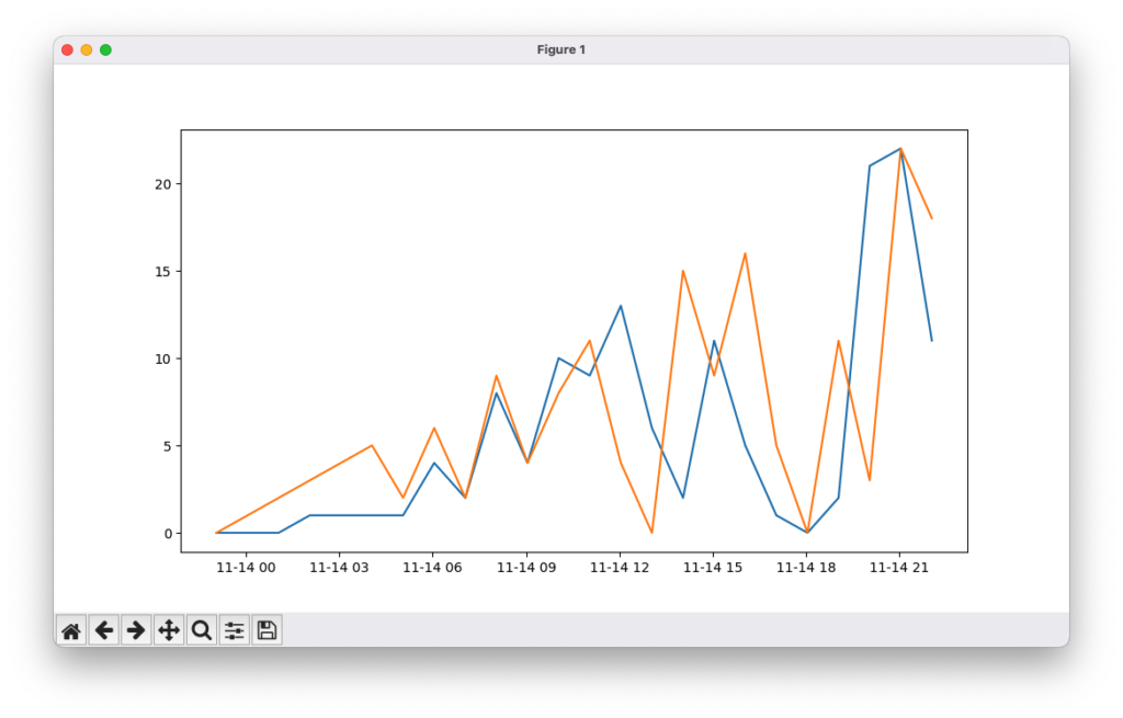
You can also plot multiple lines like this
Scatter Chart
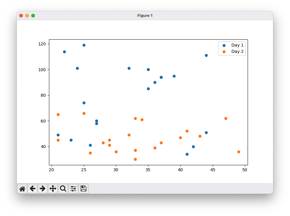
A scatter plot is a graphical representation in which each value in a dataset is plotted as a dot. It is used to visualize the relationship or correlation between two variables. The position of each dot along the x-axis and y-axis corresponds to the values of the two variables. Scatter plots are useful for identifying patterns, trends, clusters, and outliers in data
Example
from datetime import datetime, timedelta # Import date/time tools (not used in this example)
import numpy as np # Import NumPy for generating random data
import matplotlib.pyplot as plt # Import Matplotlib for plotting
x_1 = np.random.randint(low=20, high=50, size=20) # Generate 20 random x-values for Day 1
y_1 = np.random.randint(low=25, high=120, size=20) # Generate 20 random y-values for Day 1
x_2 = np.random.randint(low=20, high=50, size=20) # Generate 20 random x-values for Day 2
y_2 = np.random.randint(low=25, high=70, size=20) # Generate 20 random y-values for Day 2
plt.scatter(x_1, y_1) # Create scatter plot for Day 1 data
plt.scatter(x_2, y_2) # Create scatter plot for Day 2 data
plt.legend(labels=[‘Day 1’, ‘Day 2′], loc=’upper right’) # Add legend to distinguish datasets
plt.show() # Display the scatter plot
from datetime import datetime, timedelta
import numpy as np
import matplotlib.pyplot as plt
x_1 = np.random.randint(low=20,high=50, size=20)
y_1 = np.random.randint(low=25,high=120, size=20)
x_2 = np.random.randint(low=20,high=50, size=20)
y_2 = np.random.randint(low=25,high=70, size=20)
plt.scatter(x_1,y_1)
plt.scatter(x_2,y_2)
plt.legend(labels=['Day 1', 'Day 2'], loc='upper right')
plt.show()
Output
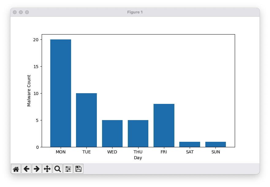
Bar Chart
A bar chart is a graphical representation in which values are depicted as vertical or horizontal bars. The length of each bar corresponds to the magnitude of the value it represents, making it easy to compare different categories or groups. Bar charts are commonly used to display discrete data, such as sales by product, population by region, or survey results
Example
from datetime import datetime, timedelta # Import date/time tools (not used in this example)
import matplotlib.ticker as mticker # Import ticker module to control axis ticks
import numpy as np # Import NumPy for handling arrays
import matplotlib.pyplot as plt # Import Matplotlib for plotting
x = np.array([“MON”, “TUE”, “WED”, “THU”, “FRI”, “SAT”, “SUN”]) # Days of the week
y = np.array([20, 10, 5, 5, 8, 1, 1]) # Malware counts per day
plt.bar(x, y) # Create a bar chart
plt.gca().yaxis.set_major_locator(mticker.MultipleLocator(5)) # Set y-axis ticks at intervals of 5
plt.xlabel(‘Day’) # Label x-axis
plt.ylabel(‘Malware Count’) # Label y-axis
plt.show() # Display the bar chart
from datetime import datetime, timedelta
import matplotlib.ticker as mticker
import numpy as np
import matplotlib.pyplot as plt
x = np.array(["MON", "TUE", "WED", "THU", "FRI", "SAT", "SUN"])
y = np.array([20,10, 5, 5, 8, 1, 1])
plt.bar(x,y)
plt.gca().yaxis.set_major_locator(mticker.MultipleLocator(5))
plt.xlabel('Day')
plt.ylabel('Malware Count')
plt.show()
Output
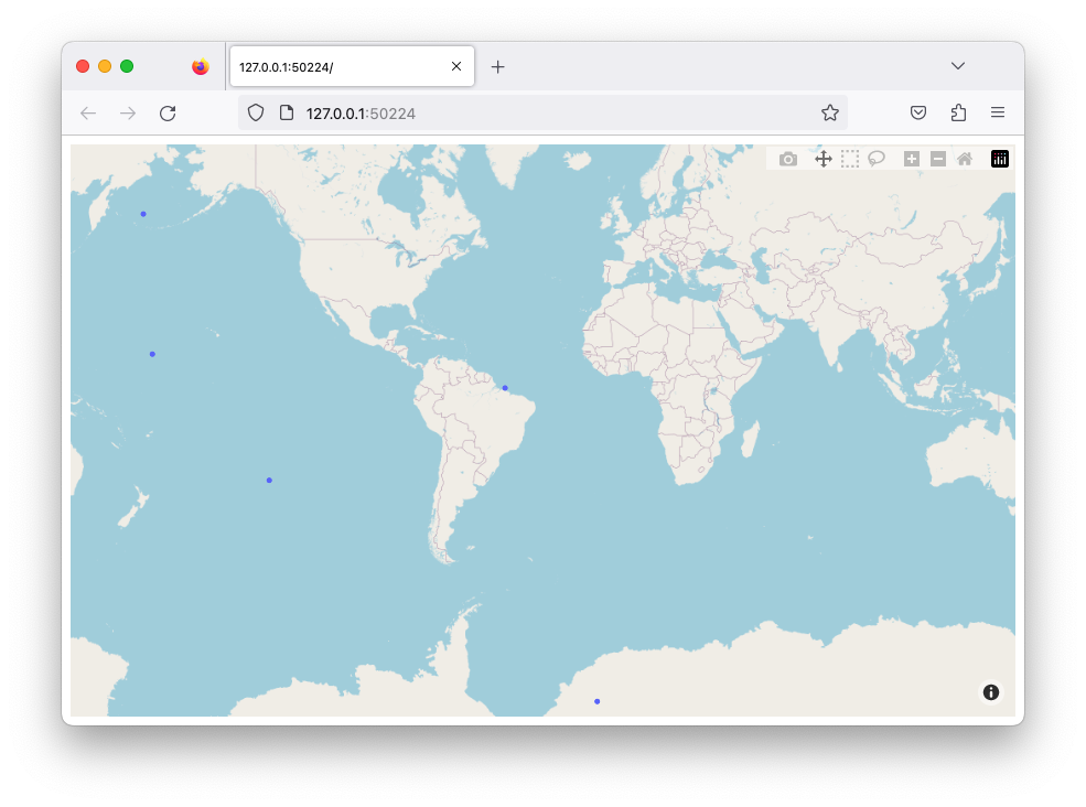
Maps
Maps are a type of data visualization used to display geographic data. You can plot points, lines, or areas on a map to show locations, routes, or spatial patterns. Tools like Plotly provide built-in integration with OpenStreetMap, allowing you to create interactive maps without needing an access token. Maps are useful for visualizing data such as population distribution, weather patterns, travel routes, or incidents across different locations
Example
import plotly.express as px # Import Plotly Express for interactive plotting
from random import uniform # Import uniform to generate random floating-point numbers
temp_list = [] # Initialize empty list to store random coordinates
for i in range(5): # Loop 5 times
temp_list.append({‘lat’: round(uniform(-90, 90), 5), ‘lon’: round(uniform(-180, 180), 5)}) # Append a dictionary with random latitude (-90 to 90) and longitude (-180 to 180)
fig = px.scatter_mapbox(temp_list, lat=”lat”, lon=”lon”, zoom=3) # Create an interactive scatter map using the generated coordinates
fig.update_layout(mapbox_style=”open-street-map”, margin={“r”:0,”t”:0,”l”:0,”b”:0}) # Set the map style and remove extra margins
fig.show() # Display the interactive map
import plotly.express as px
from random import uniform

temp_list = []

for i in range(5):
    temp_list.append({'lat':round(uniform( -90,  90), 5),'lon':round(uniform(-180, 180), 5)})

fig = px.scatter_mapbox(temp_list, lat="lat", lon="lon", zoom=3)
fig.update_layout(mapbox_style="open-street-map", margin={"r":0,"t":0,"l":0,"b":0})
fig.show()
Output
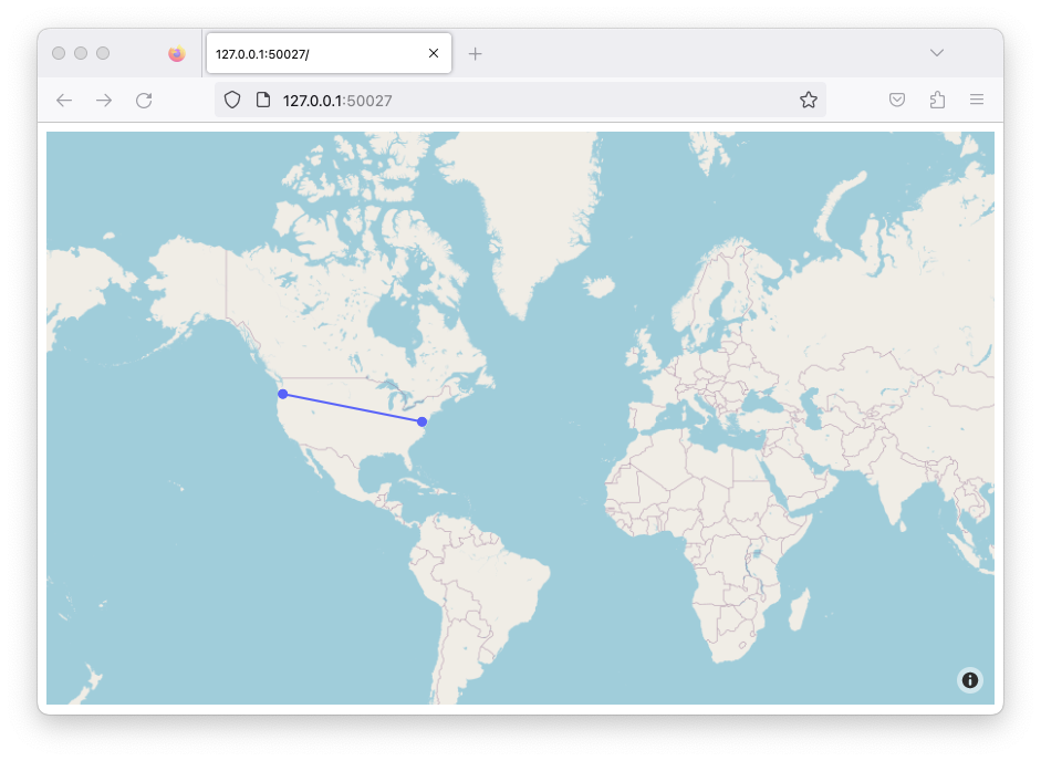
You can also add lines between dots
Example
import plotly.graph_objects as go # Import Plotly Graph Objects for more customizable plots
fig = go.Figure(go.Scattermapbox( # Create a scatter map with markers connected by lines
mode=”markers+lines”, # Show both points (markers) and connecting lines
lat=[45.6280, 38.9072], # Latitude coordinates of the points
lon=[-122.6615, -77.0369], # Longitude coordinates of the points
marker={‘size’: 10} # Set the size of the markers
))
fig.update_layout(mapbox_style=”open-street-map”, margin={“r”:0, “t”:0, “l”:0, “b”:0}) # Set map style and remove extra margins
fig.show() # Display the interactive map
import plotly.graph_objects as go

fig = go.Figure(go.Scattermapbox(
    mode = "markers+lines",
    lat = [45.6280, 38.9072],
    lon = [-122.6615, -77.0369 ],
    marker = {'size': 10}))

fig.update_layout(mapbox_style="open-street-map",margin={"r":0,"t":0,"l":0,"b":0})
fig.show()
Output